
Brand
Guidelines
Guidelines
This guide defines the visual language, design style, and principles that shape a clear and consistent brand experience, no matter the team or area of expertise.
At its core, Dr. Blecha is about results and efficiency on skincare, deleting any overkilling routines and educating people into real skincare . This guide lays out the essential design standards that bring our brand to life, from our colour system and typography to accessibility benchmarks and documentation.
Whether you're designing for digital platforms or printed materials, these guidelines ensure every touchpoint reflects the trust and professsionalism at the heart of Dr.Blecha.
Contents
01
Brand Strategy
02
Personality
03
Logo
04
Color
05
Typography
06
Art Direction
01
Brand
Strategy
Strategy
15-step skincare routine is part of the past.
Dr.Blecha has been created to save time, resources and optimize all those never-ending routines.
Our brand is made for people aged 55+ who wants to take proper care of their skin, with recipes that ensures results.
Dr. Blecha is a reknown dermathologist with years of experience in their field. With the increase of patients with skin issues derived from overwhelming the skin with products and chemicals, she created her own cosmetic brand under the motto of
If you wouldn’t put it on leather, why put it on your skin?
02
Personality
Dr. Blecha’s voice brings our brand to life through the words we write and speak. The way we communicate with customers has the power to transform their skin well-being. Through clear and intentional language, we make skincare education simple, accessible, and stress-free. Our direct, approachable, and transparent voice ensures that take care of your skin feels effortless—so our clients can start looking after their skin with confidence.
Effective
Reliable
Smart
Friendly
1a
Tone & Voice
Our Vision: why we exist
To demonstrate that skincare can be simple, effective and reliable.
Our Mission: what we do
Design cosmetics that have real benefits to your skin
Our Promise: how we help
We created a full collection of skincare products with proven results.
1b
Sample Copy
This active ingredient helps your skin glow. We tell you why.
We solve questions and educate our clients so they understand what their skin need.
If you wouldn’t put it on leather, why do you put it on your skin?
Asking questions to our clients will make them think and choose wisely.
No more 7-step routines. With (product name) is enough.
Your time is valuable, and skincare shouldn’t take an hour. We created our products to save time and effort.
Less is more, specially for your skin
Simple and direct messages showcase our aim for efficiency.
03
Logo
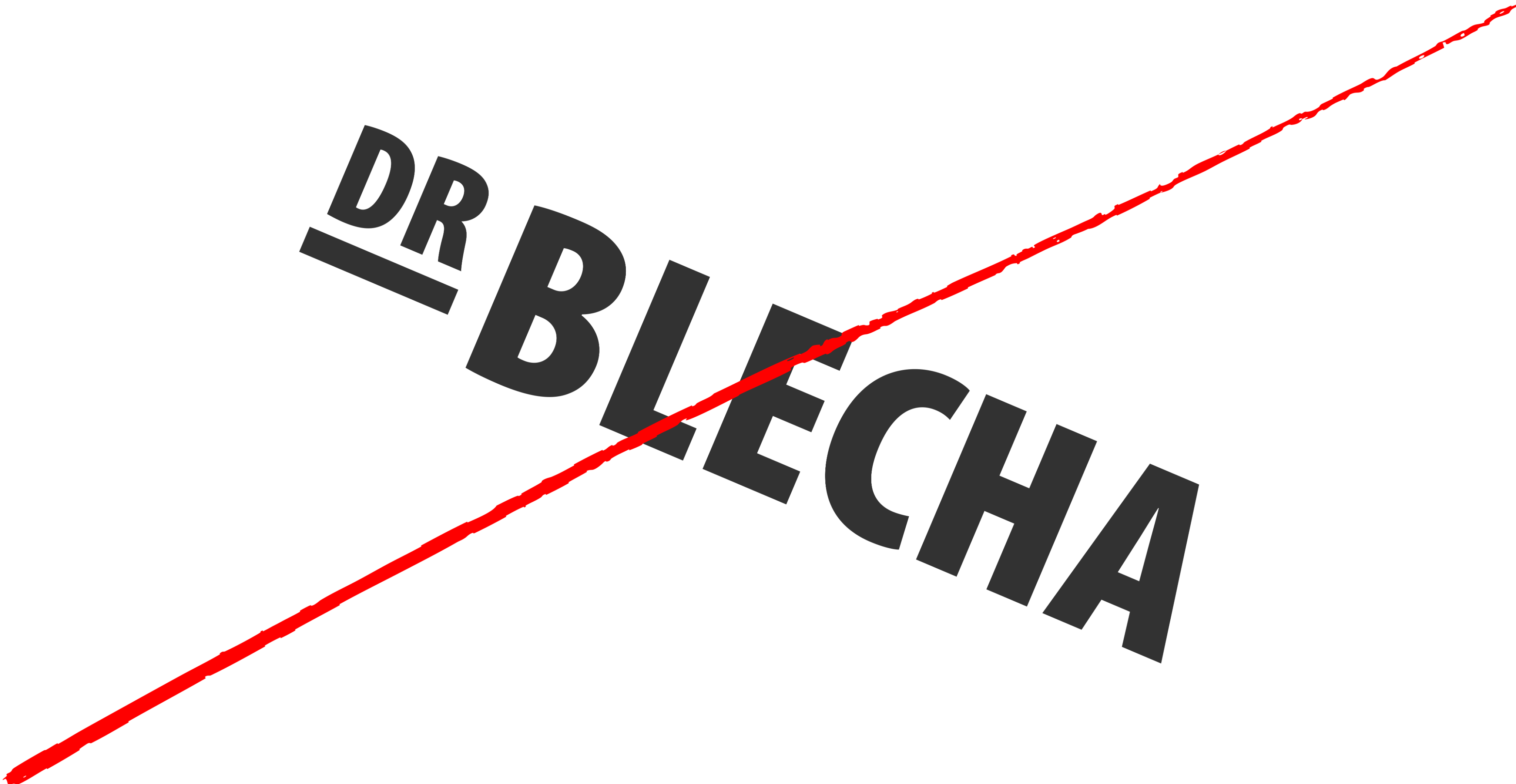
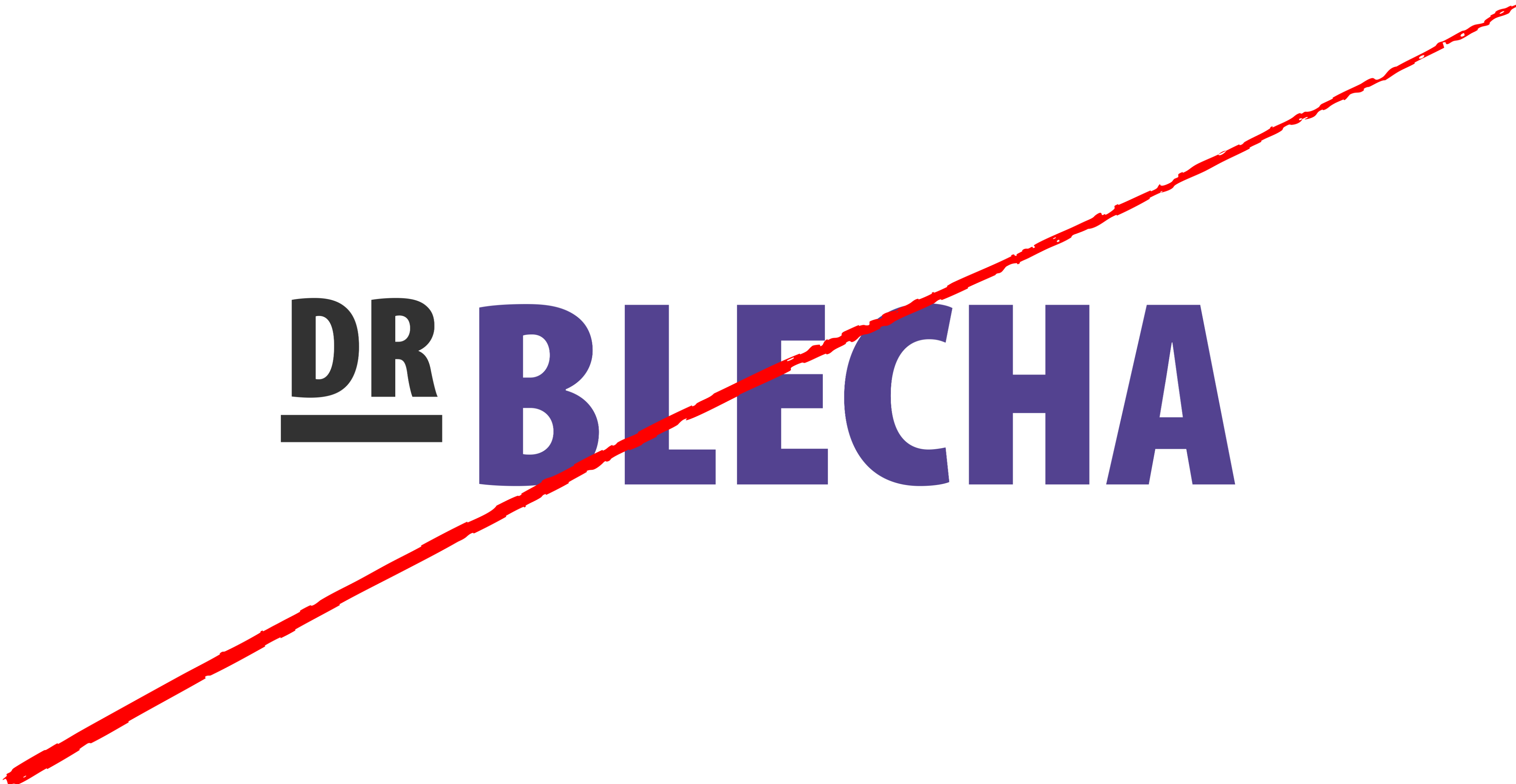
The logo for Dr. Blecha is a stunning embodiment of elegance and simplicity, designed exclusively in the Myriad Pro font. The bold, crisp lines of the typography exude sophistication, while the minimalist design echoes our philosophy of "less is more."
Each letter is perfectly spaced to achieve a sense of balance and harmony, capturing the essence of minimalism that characterises our brand.
This logo not only draws the eye but also conveys our dedication to providing high-quality skincare focused on purity and effectiveness.
3a
Primary Lockup

3b
Clearspace


1.5x
X
X
X
X
3c
Secondary Lockups

3d
Incorrect Usage

Do not resize the mark
Do not rotate the logo
Do not change the color of the mark alone
Do not outline the logo
Do not reverse the lockup
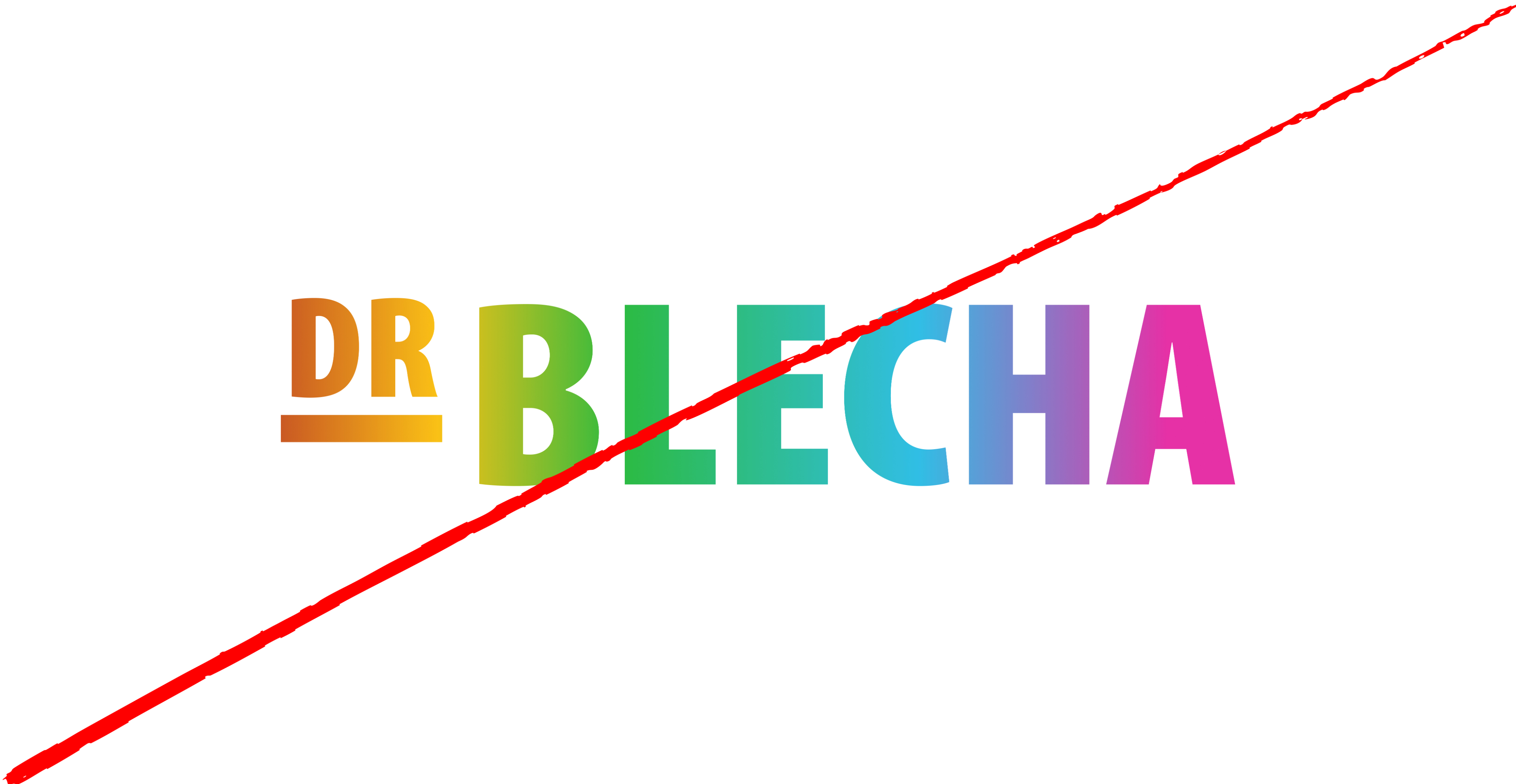
Do not add unauthorised gradients
04
Color
Dr.Blecha’s color palette is designed to evoke fun, reliability and bring vibrancy to our lives.
Saturated colours that reminds us to our childhood and evokes nostalgia but also good energy and aliveness. As senior people, we collect this colours and make them ours, allowing us to enjoy skincare without the boring part.
3a
Primary Palette
Orange
Hex: #FA9819
Blue Tint
Hex: #B6C9CF
White
Hex: #000000
Baby Blue
Hex: #C6EBF7
3a
Secondary Palette
Navy
Hex: #1E3D59
Caption
Hex: #48749E
Sky Blue
Hex: #DEEEFE
Off-blue
Hex: #E8EBEF
3a
Gradient Palette
Gradient 1
Gradient 2

Gradient 3

Gradient 4
05
Typography
As our core value is minimalism, we’re using Myriad pro as our main and unique font, just like our brand’s typeface.
Aa
Primary Sans-Serif (Myriad Pro regular) is a clean, modern sans-serif typeface that ensures legibility and precision across all digital and print materials. Its geometric structure reflects clarity, efficiency, and trust, making it the ideal choice for a brand defined by luxury and efficiency.
Secondary Sans-serif (Open Sans) is a refined, authoritative serif font that adds a touch of tradition and credibility. Used for short body texts on social media and captions.
This sans-serif combination creates a smooth contrast—modern yet trustworthy, classic yet approachable, ensuring Dr.Blecha’s brand communication is always clear, professional, and dependable.
- Primary Typeface
Myriad Pro
- Secondary Typeface
Open Sans
5b
Sizing
Since our brand is targeted to older people, we want our products and graphic media to be approachable and readable. Therefore, our texts are going to be a bit bigger, but balanced with the context they are placed on.
Financial errors shouldn’t slow you down or cause unnecessary stress. Whether it’s an incorrect charge, a duplicate transaction, or a miscalculated fee, we step in to make things right. Our process is simple, straightforward, and designed to get your money back where it belongs—quickly and without hassle.
Type Sizes 0–24pt/px
130% Leading
0% Tracking
Our team works diligently to recover lost funds, correct inaccuracies, and keep your financial records accurate—so you can feel confident about every dollar in your account.
Type Sizes 24–55pt/px
120% Leading
-1% Tracking
Whether it’s a bank error, an unauthorized charge, or an overlooked refund, we ensure you don’t pay for something you shouldn’t have.
Type Sizes 55–72pt/px
110% Leading
-2% Tracking
Clear Up Confusion, Gain Peace of Mind
Type Sizes > 72pt/px
100% Leading
-2% Tracking
06
Art Direction
Redo’s photography style reinforces our brand’s core values—trust, clarity, and financial empowerment—by showcasing visuals that reflect professionalism, accuracy, and control.
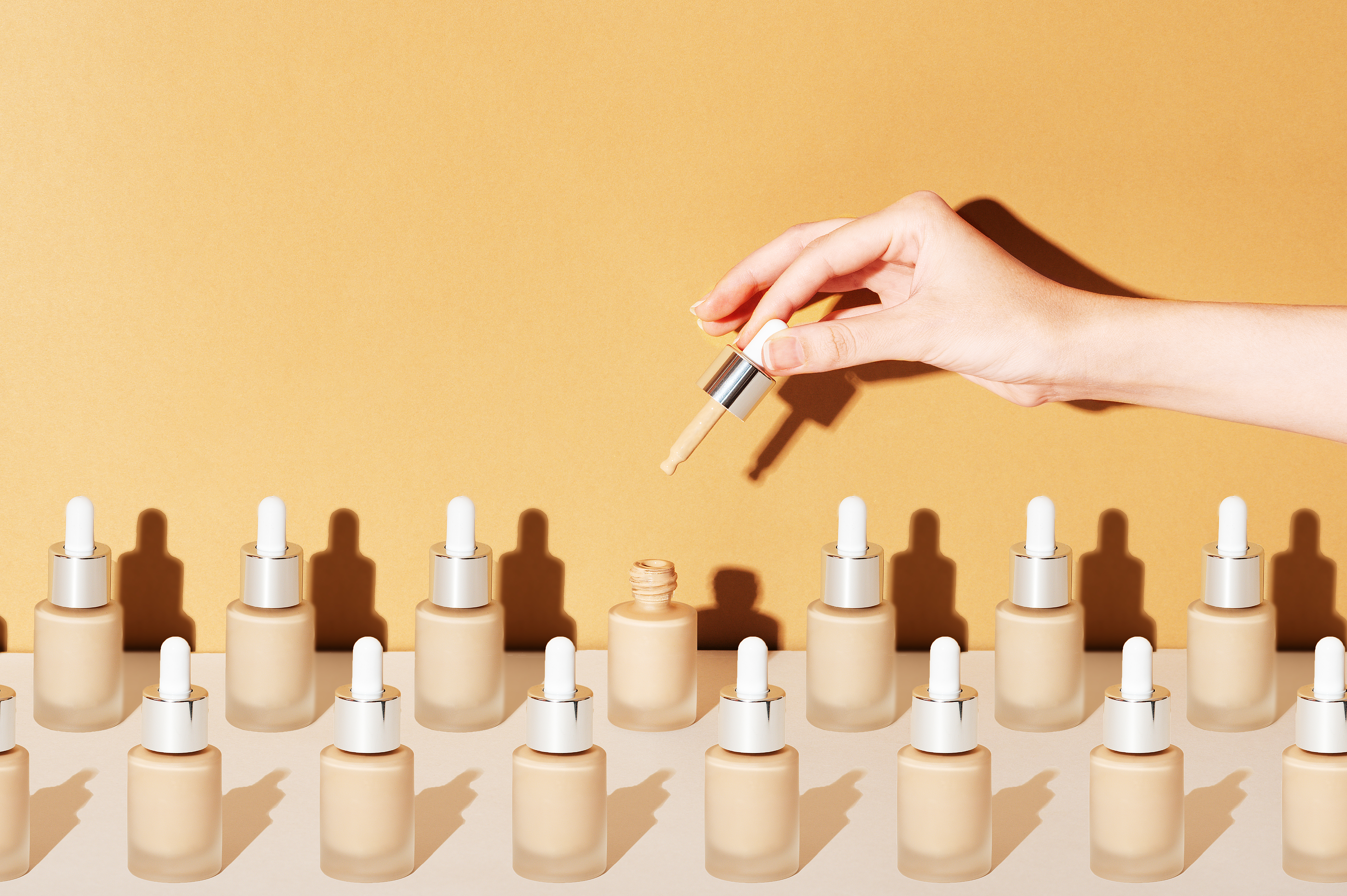
Fun and approachable
Photography should feature modern, well-lit workspaces with a clean and organized feel. The focus should be on clarit, avoiding clutter or overly dramatic compositions.
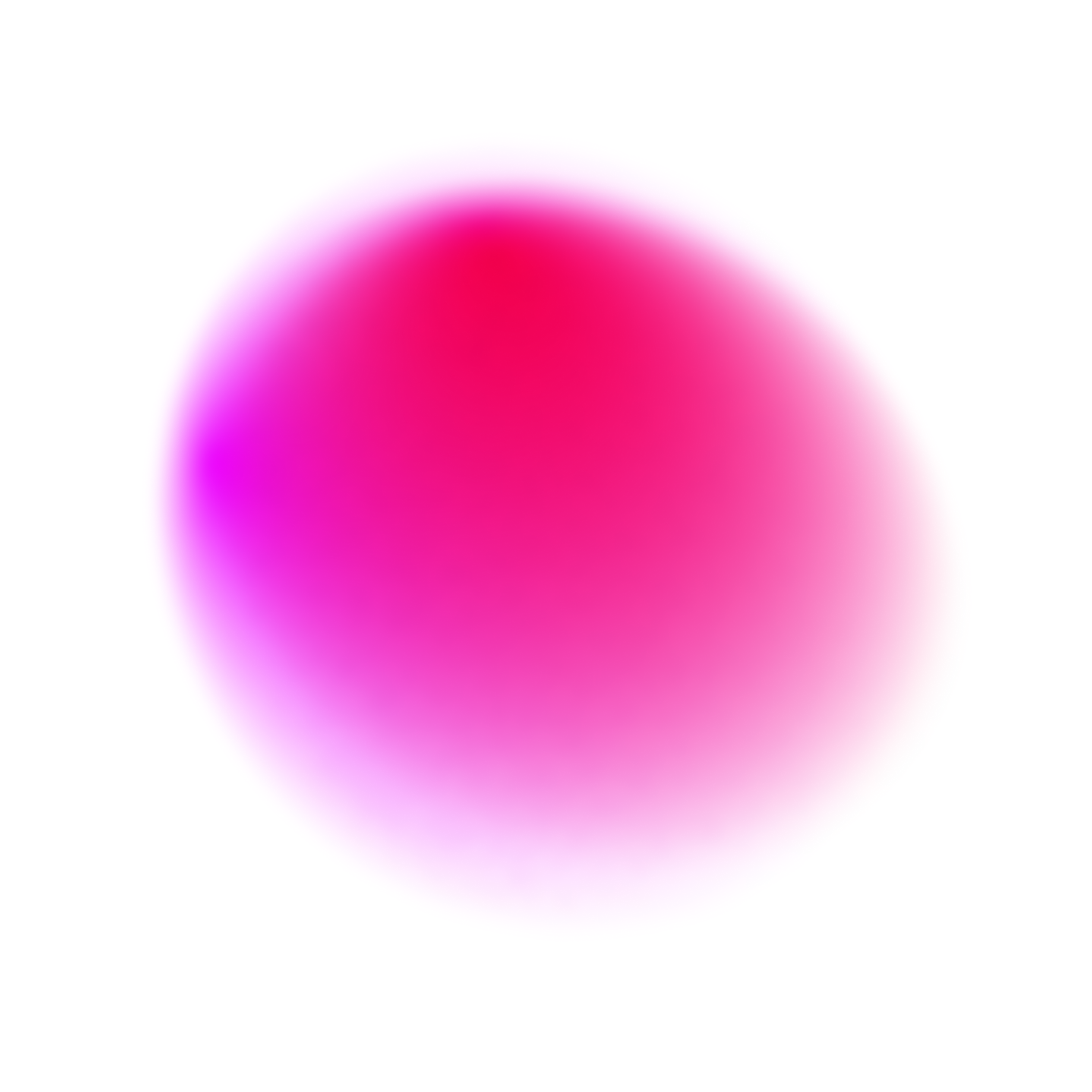
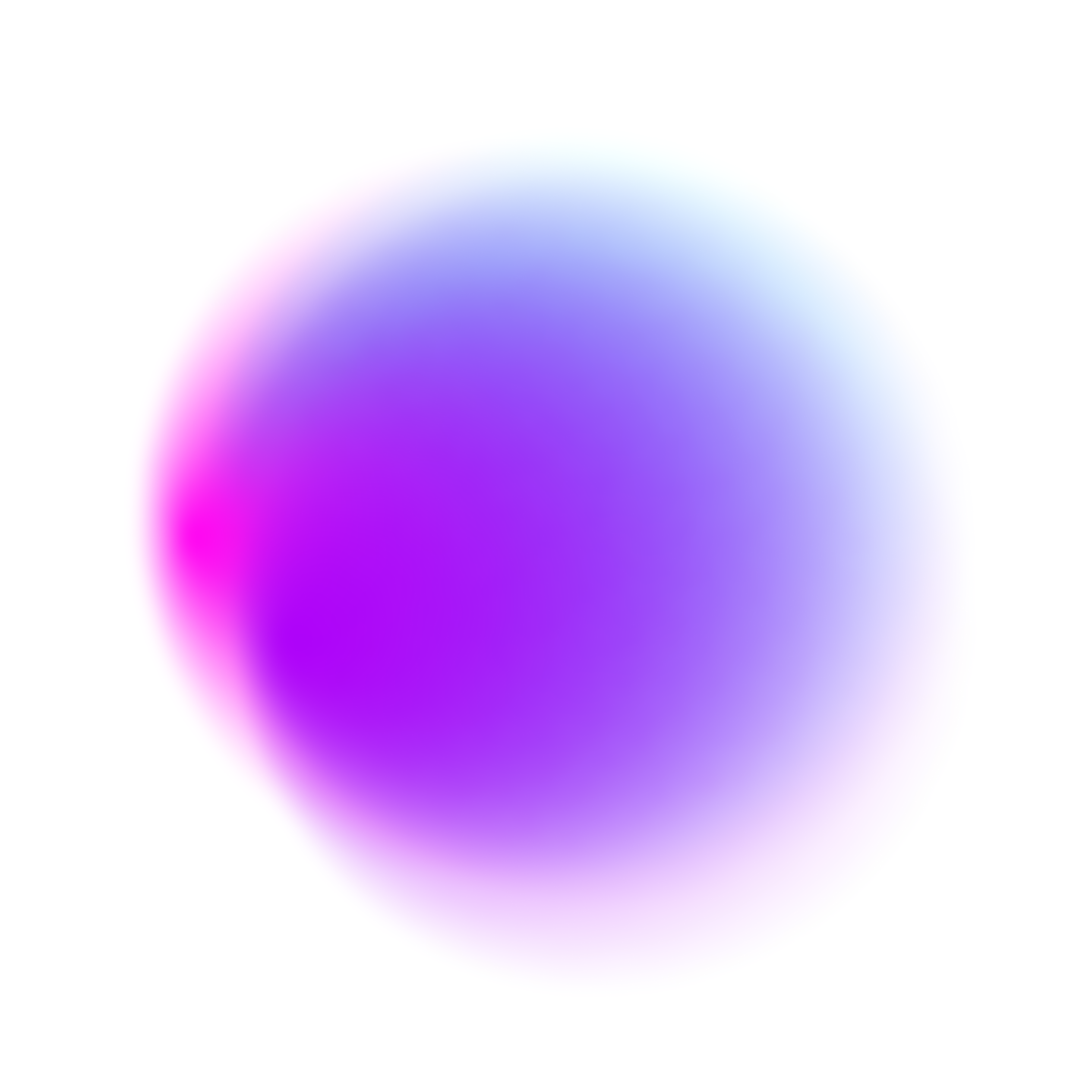
Abstract and futuristic
Motion graphic elements include blurry circular and curvy shapes with the colours of the brand.

Luxury storytelling
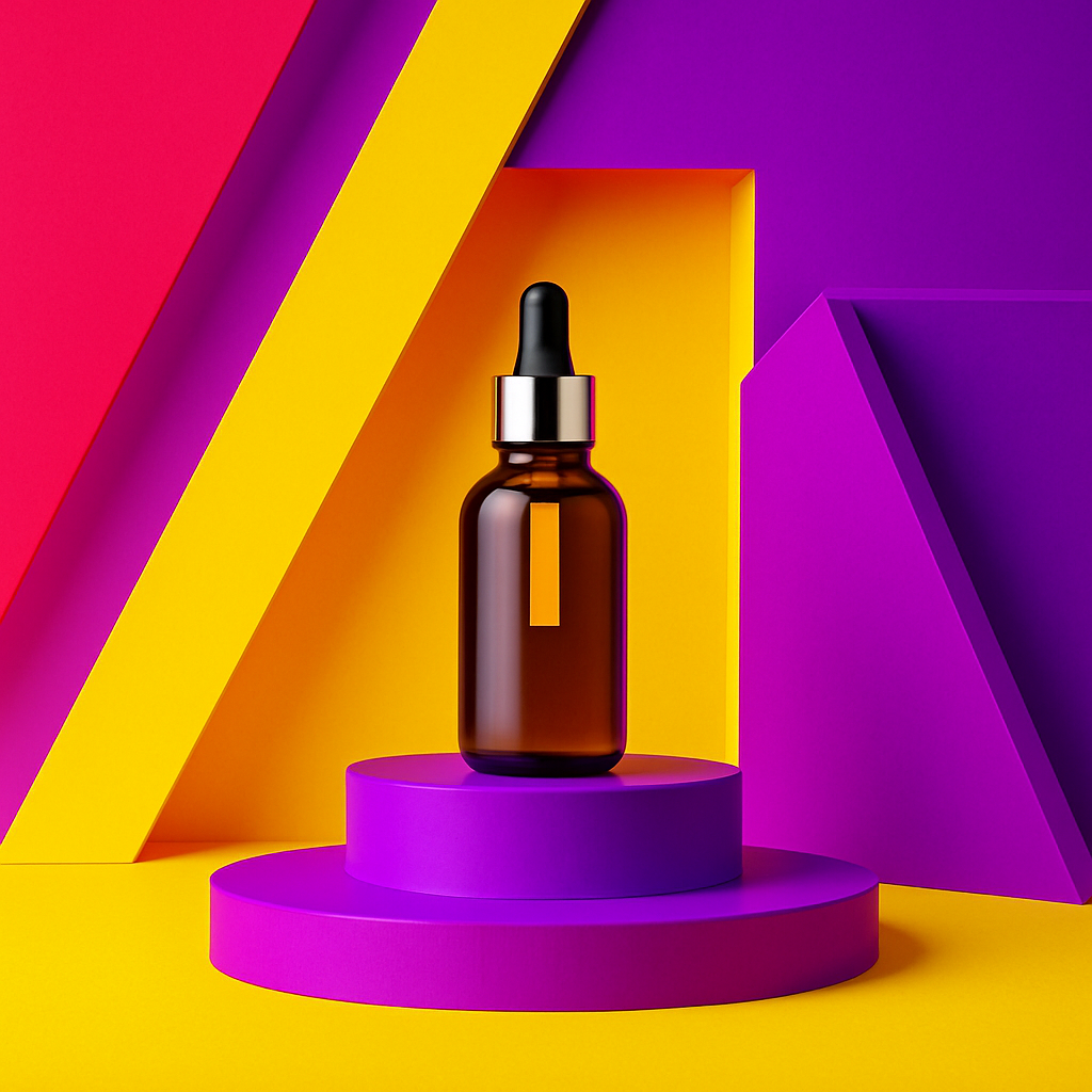
Images should capture real-world senior lifestyle scenarios—outdoor activities, social life, skincare time and romantic moments. This reinforces Dr.Blecha’s role in helping people feel pretty and improve their self-steem.


Seniors redefined
Images with people should show seniors: feeling luxurious or just enjoying the little things in life. They are happy. They want their skin to look as young as their souls.

© Dr.Blecha
Legal
Privacy
All Rights Reserved


Brand
Guidelines
Guidelines
This guide defines the visual language, design style, and principles that shape a clear and consistent brand experience, no matter the team or area of expertise.
At its core, Dr. Blecha is about results and efficiency on skincare, deleting any overkilling routines and educating people into real skincare . This guide lays out the essential design standards that bring our brand to life, from our colour system and typography to accessibility benchmarks and documentation.
Whether you're designing for digital platforms or printed materials, these guidelines ensure every touchpoint reflects the trust and professsionalism at the heart of Dr.Blecha.
Contents
01
Brand Strategy
02
Personality
03
Logo
04
Color
05
Typography
06
Art Direction
01
Brand
Strategy
Strategy
15-step skincare routine is part of the past.
Dr.Blecha has been created to save time, resources and optimize all those never-ending routines.
Our brand is made for people aged 55+ who wants to take proper care of their skin, with recipes that ensures results.
Dr. Blecha is a reknown dermathologist with years of experience in their field. With the increase of patients with skin issues derived from overwhelming the skin with products and chemicals, she created her own cosmetic brand under the motto of
If you wouldn’t put it on leather, why put it on your skin?
02
Personality
Dr. Blecha’s voice brings our brand to life through the words we write and speak. The way we communicate with customers has the power to transform their skin well-being. Through clear and intentional language, we make skincare education simple, accessible, and stress-free. Our direct, approachable, and transparent voice ensures that take care of your skin feels effortless—so our clients can start looking after their skin with confidence.
Effective
Reliable
Smart
Friendly
1a
Tone & Voice
Our Vision: why we exist
To demonstrate that skincare can be simple, effective and reliable.
Our Mission: what we do
Design cosmetics that have real benefits to your skin
Our Promise: how we help
We created a full collection of skincare products with proven results.
1b
Sample Copy
Less is more, specially for your skin
Simple and direct messages showcase our aim for efficiency.
No more 7-step routines. With (product name) is enough.
Your time is valuable, and skincare shouldn’t take an hour. We created our products to save time and effort.
If you wouldn’t put it on leather, why do you put it on your skin?
Asking questions to our clients will make them think and choose wisely.
This active ingredient helps your skin glow. We tell you why.
We solve questions and educate our clients so they understand what their skin need.
03
Logo
The logo for Dr. Blecha is a stunning embodiment of elegance and simplicity, designed exclusively in the Myriad Pro font. The bold, crisp lines of the typography exude sophistication, while the minimalist design echoes our philosophy of "less is more."
Each letter is perfectly spaced to achieve a sense of balance and harmony, capturing the essence of minimalism that characterises our brand.
This logo not only draws the eye but also conveys our dedication to providing high-quality skincare focused on purity and effectiveness.
3a
Primary Lockup

3b
Clearspace


1.5x
X
X
X
X
3c
Secondary Lockups

3d
Incorrect Usage
Do not resize the mark
Do not rotate the logo
Do not change the color of the mark alone
Do not outline the logo
Do not reverse the lockup
Do not add unauthorised gradients
04
Color
Dr.Blecha’s color palette is designed to evoke fun, reliability and bring vibrancy to our lives.
Saturated colours that reminds us to our childhood and evokes nostalgia but also good energy and aliveness. As senior people, we collect this colours and make them ours, allowing us to enjoy skincare without the boring part.
3a
Primary Palette
Orange
Hex: #FA9819
Blue Tint
Hex: #B6C9CF
White
Hex: #000000
Baby Blue
Hex: #C6EBF7
3a
Secondary Palette
Navy
Hex: #1E3D59
Caption
Hex: #48749E
Sky Blue
Hex: #DEEEFE
Off-blue
Hex: #E8EBEF
3a
Gradient Palette
Gradient 1
Gradient 2
Gradient 3
Gradient 4
05
Typography
As our core value is minimalism, we’re using Myriad pro as our main and unique font, just like our brand’s typeface.
Aa
Primary Sans-Serif (Myriad Pro regular) is a clean, modern sans-serif typeface that ensures legibility and precision across all digital and print materials. Its geometric structure reflects clarity, efficiency, and trust, making it the ideal choice for a brand defined by luxury and efficiency.
Secondary Sans-serif (Open Sans) is a refined, authoritative serif font that adds a touch of tradition and credibility. Used for short body texts on social media and captions.
This sans-serif combination creates a smooth contrast—modern yet trustworthy, classic yet approachable, ensuring Dr.Blecha’s brand communication is always clear, professional, and dependable.
- Primary Typeface
Myriad Pro
- Secondary Typeface
Open Sans
Financial errors shouldn’t slow you down or cause unnecessary stress. Whether it’s an incorrect charge, a duplicate transaction, or a miscalculated fee, we step in to make things right. Our process is simple, straightforward, and designed to get your money back where it belongs—quickly and without hassle.
Type Sizes 0–24pt/px
130% Leading
0% Tracking
Our team works diligently to recover lost funds, correct inaccuracies, and keep your financial records accurate—so you can feel confident about every dollar in your account.
Type Sizes 24–55pt/px
120% Leading
-1% Tracking
Whether it’s a bank error, an unauthorized charge, or an overlooked refund, we ensure you don’t pay for something you shouldn’t have.
Type Sizes 55–72pt/px
110% Leading
-2% Tracking
Clear Up Confusion, Gain Peace of Mind
Type Sizes > 72pt/px
100% Leading
-2% Tracking
5b
Sizing
Since our brand is targeted to older people, we want our products and graphic media to be approachable and readable. Therefore, our texts are going to be a bit bigger, but balanced with the context they are placed on.
06
Art Direction
Redo’s photography style reinforces our brand’s core values—trust, clarity, and financial empowerment—by showcasing visuals that reflect professionalism, accuracy, and control.
Fun and approachable
Photography should feature modern, well-lit workspaces with a clean and organized feel. The focus should be on clarit, avoiding clutter or overly dramatic compositions.
Abstract and futuristic
Motion graphic elements include blurry circular and curvy shapes with the colours of the brand.
Luxury storytelling
Images should capture real-world senior lifestyle scenarios—outdoor activities, social life, skincare time and romantic moments. This reinforces Dr.Blecha’s role in helping people feel pretty and improve their self-steem.
Seniors redefined
Images with people should show seniors: feeling luxurious or just enjoying the little things in life. They are happy. They want their skin to look as young as their souls.

© Dr.Blecha
Legal
Privacy
All Rights Reserved

Contact Us
Brand Strategy
01
Personality
02
Logo
03
Color
04
Typography
05
Art Direction
06


Brand
Guidelines
Guidelines
This guide defines the visual language, design style, and principles that shape a clear and consistent brand experience, no matter the team or area of expertise.
At its core, Dr. Blecha is about results and efficiency on skincare, deleting any overkilling routines and educating people into real skincare . This guide lays out the essential design standards that bring our brand to life, from our colour system and typography to accessibility benchmarks and documentation.
Whether you're designing for digital platforms or printed materials, these guidelines ensure every touchpoint reflects the trust and professsionalism at the heart of Dr.Blecha.
Contents
01
Brand Strategy
02
Personality
03
Logo
04
Color
05
Typography
06
Art Direction
01
Brand
Strategy
Strategy
15-step skincare routine is part of the past.
Dr.Blecha has been created to save time, resources and optimize all those never-ending routines.
Our brand is made for people aged 55+ who wants to take proper care of their skin, with recipes that ensures results.
Dr. Blecha is a reknown dermathologist with years of experience in their field. With the increase of patients with skin issues derived from overwhelming the skin with products and chemicals, she created her own cosmetic brand under the motto of
If you wouldn’t put it on leather, why put it on your skin?
02
Personality
Dr. Blecha’s voice brings our brand to life through the words we write and speak. The way we communicate with customers has the power to transform their skin well-being. Through clear and intentional language, we make skincare education simple, accessible, and stress-free. Our direct, approachable, and transparent voice ensures that take care of your skin feels effortless—so our clients can start looking after their skin with confidence.
Effective
Reliable
Smart
Friendly
1a
Tone & Voice
Our Vision: why we exist
To demonstrate that skincare can be simple, effective and reliable.
Our Mission: what we do
Design cosmetics that have real benefits to your skin
Our Promise: how we help
We created a full collection of skincare products with proven results.
1b
Sample Copy
Less is more, specially for your skin
Simple and direct messages showcase our aim for efficiency.
No more 7-step routines. With (product name) is enough.
Your time is valuable, and skincare shouldn’t take an hour. We created our products to save time and effort.
If you wouldn’t put it on leather, why do you put it on your skin?
Asking questions to our clients will make them think and choose wisely.
This active ingredient helps your skin glow. We tell you why.
We solve questions and educate our clients so they understand what their skin need.
03
Logo
The logo for Dr. Blecha is a stunning embodiment of elegance and simplicity, designed exclusively in the Myriad Pro font. The bold, crisp lines of the typography exude sophistication, while the minimalist design echoes our philosophy of "less is more."
Each letter is perfectly spaced to achieve a sense of balance and harmony, capturing the essence of minimalism that characterises our brand.
This logo not only draws the eye but also conveys our dedication to providing high-quality skincare focused on purity and effectiveness.
3a
Primary Lockup

3b
Clearspace

1.5x
X
X
X
X
3c
Secondary Lockups
3d
Incorrect Usage
Do not resize the mark
Do not rotate the logo
Do not change the color of the mark alone
Do not outline the logo
Do not reverse the lockup
Do not add unauthorised gradients
04
Color
Dr.Blecha’s color palette is designed to evoke fun, reliability and bring vibrancy to our lives.
Saturated colours that reminds us to our childhood and evokes nostalgia but also good energy and aliveness. As senior people, we collect this colours and make them ours, allowing us to enjoy skincare without the boring part.
3a
Primary Palette
Orange
Hex: #FA9819
Blue Tint
Hex: #B6C9CF
White
Hex: #000000
Baby Blue
Hex: #C6EBF7
3a
Secondary Palette
Navy
Hex: #1E3D59
Caption
Hex: #48749E
Sky Blue
Hex: #DEEEFE
Off-blue
Hex: #E8EBEF
3a
Gradient Palette
Gradient 1
Gradient 2
Gradient 3
Gradient 4
05
Typography
As our core value is minimalism, we’re using Myriad pro as our main and unique font, just like our brand’s typeface.
Aa
Primary Sans-Serif (Myriad Pro regular) is a clean, modern sans-serif typeface that ensures legibility and precision across all digital and print materials. Its geometric structure reflects clarity, efficiency, and trust, making it the ideal choice for a brand defined by luxury and efficiency.
Secondary Sans-serif (Open Sans) is a refined, authoritative serif font that adds a touch of tradition and credibility. Used for short body texts on social media and captions.
This sans-serif combination creates a smooth contrast—modern yet trustworthy, classic yet approachable, ensuring Dr.Blecha’s brand communication is always clear, professional, and dependable.
- Primary Typeface
Myriad Pro
- Secondary Typeface
Open Sans
5b
Sizing
Since our brand is targeted to older people, we want our products and graphic media to be approachable and readable. Therefore, our texts are going to be a bit bigger, but balanced with the context they are placed on.
Clear Up Confusion, Gain Peace of Mind
Type Sizes > 72pt/px
100% Leading
-2% Tracking
Whether it’s a bank error, an unauthorized charge, or an overlooked refund, we ensure you don’t pay for something you shouldn’t have.
Type Sizes 55–72pt/px
110% Leading
-2% Tracking
Our team works diligently to recover lost funds, correct inaccuracies, and keep your financial records accurate—so you can feel confident about every dollar in your account.
Type Sizes 24–55pt/px
120% Leading
-1% Tracking
Financial errors shouldn’t slow you down or cause unnecessary stress. Whether it’s an incorrect charge, a duplicate transaction, or a miscalculated fee, we step in to make things right. Our process is simple, straightforward, and designed to get your money back where it belongs—quickly and without hassle.
Type Sizes 0–24pt/px
130% Leading
0% Tracking
06
Art Direction
Redo’s photography style reinforces our brand’s core values—trust, clarity, and financial empowerment—by showcasing visuals that reflect professionalism, accuracy, and control.
Fun and approachable
Photography should feature modern, well-lit workspaces with a clean and organized feel. The focus should be on clarit, avoiding clutter or overly dramatic compositions.
Abstract and futuristic
Motion graphic elements include blurry circular and curvy shapes with the colours of the brand.
Luxury storytelling
Images should capture real-world senior lifestyle scenarios—outdoor activities, social life, skincare time and romantic moments. This reinforces Dr.Blecha’s role in helping people feel pretty and improve their self-steem.
Seniors redefined
Images with people should show seniors: feeling luxurious or just enjoying the little things in life. They are happy. They want their skin to look as young as their souls.

© Dr.Blecha
Legal
Privacy
All Rights Reserved